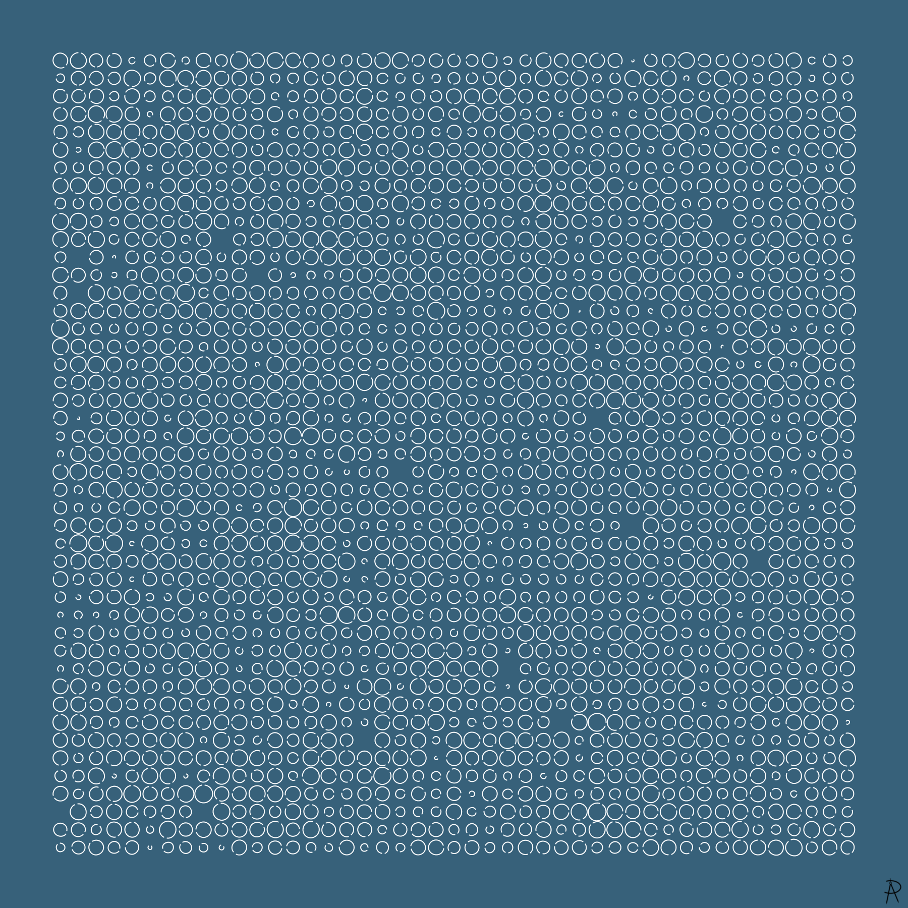
This image is made from individual curve segments, where the distances between the endpoints in each of the segments are randomly drawn from a distribution of ages at the time of death in the USA during 2007, resulting in a rough visual representation of the lengths of lives.
This image uses 2025 lifelines in the shape of a nearly complete circular arcs.
Each lifeline is placed in a 45 by 45 grid. Empty spaces are due to the lifelines of length 0 associated with infant
mortality.
The viewer is invited to reflect on population density and ponder the question How much life can our planet support?
Background and Inspiration
I first explored the idea of using curves of random length to represent lives for the December 2019 issue of Mathematics Magazine. This is another image in that series.